Here are some suggestions to visualize your results with python.
The idea is mainly to put your data in a pandas dataframe and then use pandas methods to plot it.
Bar plots
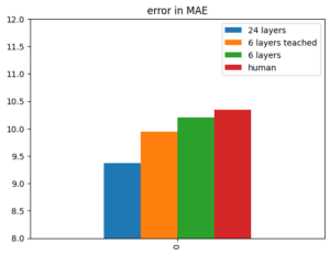
Here's the simple one with one variable:
vals = {'24 layers':9.37, '6 layers teached':9.94, '6 layers':10.20, 'human':10.34}
df_plot = pd.DataFrame(vals, index=[0])
ax = df_plot.plot(kind='bar')
ax.set_ylim(8, 12)
ax.set_title('error in MAE')
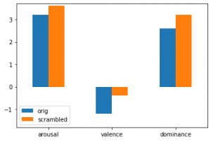
Here's an example for a barplot with two variables and three features:
vals_arou  = [3.2, 3.6]
vals_val  = [-1.2, -0.4]
vals_dom  = [2.6, 3.2]
cols = ['orig','scrambled']
plot = pd.DataFrame(columns = cols)
plot.loc['arousal'] = vals_arou
plot.loc['valence'] = vals_val
plot.loc['dominance'] = vals_dom
ax = plot.plot(kind='bar', rot=0)
ax.set_ylim(-1.8, 3.7)
# this displays the actual values
for container in ax.containers:
    ax.bar_label(container)
Stacked barplots
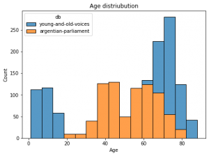
Here's an example using seaborn package for stacked barplots:
For a pandas dataframe with columns age in years and db for two database names:
import seaborn as sns
f = plt.figure(figsize=(7,5))
ax = f.add_subplot(1,1,1)
sns.histplot(data=df, ax = ax, stat="count", multiple="stack",
             x="duration", kde=False,
              hue="db",
             element="bars", legend=True)
ax.set_title("Age distriubution")
ax.set_xlabel("Age")
ax.set_ylabel("Count")
Box plots
Here's a code comparing two box plots with data dots
import seaborn as sns
import pandas as pd
n = [0.375, 0.389, 0.38, 0.346, 0.373, 0.335, 0.337, 0.363, 0.338, 0.339]
e = [0.433 0.451, 0.462, 0.464, 0.455, 0.456, 0.464, 0.461 0.457, 0.456]
data = pd.DataFrame({'simple':n, 'with soft labels':e})
sns.boxplot(data = data)
sns.swarmplot(data=data, color='.25', size=1)

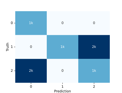
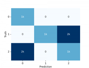
Confusion matrix
We can simply use the audplot package
from audplot import confusion_matrix

truth = [0, 1, 1, 1, 2, 2, 2] * 1000
prediction = [0, 1, 2, 2, 0, 0, 2] * 1000
confusion_matrix(truth, prediction)
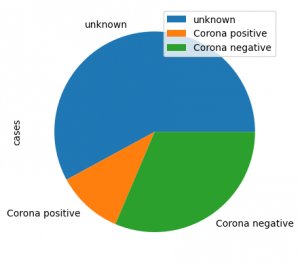
Pie plot
Here is an example for a pie plot
import pandas as pd

label=lst:code_fig_pie]
import pandas as pd
plot_df =
    pd.DataFrame({'cases':[461, 85, 250]},
    index=['unknown', 'Corona positive',
    'Corona negative'])
plot_df.plot(kind='pie', y='cases', autopct='%.2f')
looks like this:
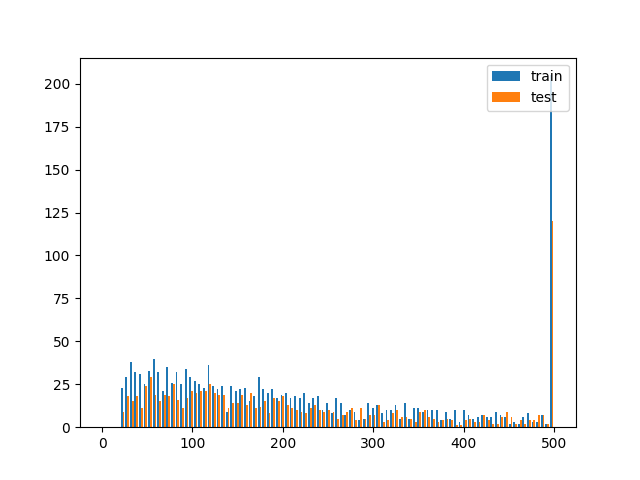
Histogram
import matplotlib.pyplot as plt
# assuming you have two dataframes with a speaker column, you could plot the histogram of samples per speaker like this
test = df_test.speaker.value_counts()[df_test.speaker.value_counts()>0]
train = df_train.speaker.value_counts()[df_train.speaker.value_counts()>0]

plt.hist([train, test], bins = np.linspace(0, 500, 100), label=['train', 'test'])
plt.legend(loc='upper right')
# better use EPS for publication as it's vector graphics (and scales)
plt.savefig('sample_dist.eps')