
It can be very interesting to reduce the dimensionality of your acoustic or learned features to two or three dimensions and then color the single samples features with the label.
Nkululeko supports three different ways to reduce the dimensionality:
- pca: Principal Componen Analysis
- tsne: t-distributed stochastic neighbor embedding
- perplexity=30, learning_rate=200
- umap: Uniform Manifold Approximation and Projection
- n_neighbors=10, random_state=0
To do this, you simply state your data and features as usual. The approaches you want to use can be set in the scatter field of the EXPL section:
[EXPL]
scatter = ['umap', 'tsne', 'pca']
(of course you don't have to use all) and then call the explore interface
python -m nkululeko.explore --config myconfig.iniYou can do this for all columns in your data, not only the target value.
If you want a scatter plot for a different target, state it like this (example):
[EXPL]
scatter = ['pca']
scatter.target = ['gender', 'age', 'likability']
And you can do it in 2 or 3-d:
[EXPL]
scatter = ['pca']
scatter.dim = 3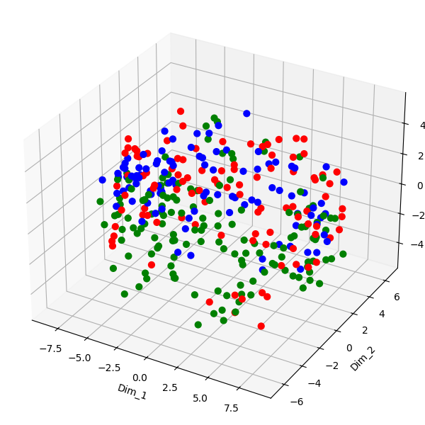
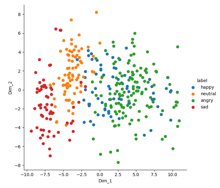
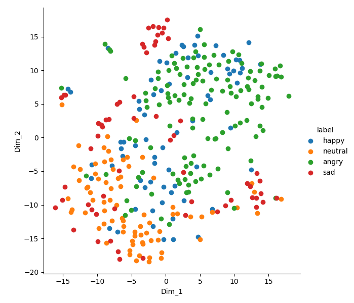
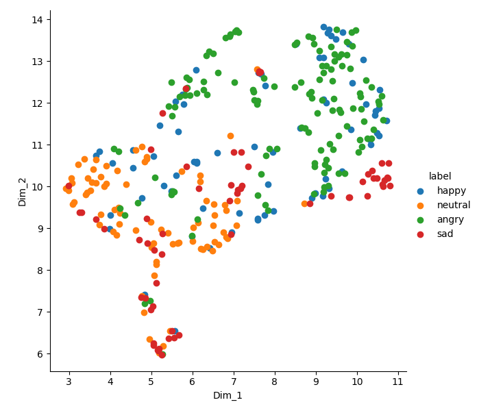
The images appear in the image folder of your experiment and might look like this (all from the same data):
PCA
T-SNE
UMAP
Prepare your data: Ensure that you have a dataset containing acoustic features extracted from audio recordings. This can include features like MFCCs (Mel-frequency cepstral coefficients), spectral centroid, pitch, or any other relevant acoustic features.